
Mobile App: MedTool
a medical supply ordering app
Role | Team Lead, Visuals, Interaction
Project Duration | June - July 2024
Project Vision
MedTool is a mobile app that can allow staff at doctors’ offices and health clinics to order supplies from one centralized location without needing to browse multiple online medical supply stores. Staff can join their organization's group, order supplies together, and easily see when deliveries will arrive. In short, it's like Amazon just for the healthcare world!
Challenges
-
Design a cohesive interface for users
-
Pull supplies from multiple locations into one easily accessible design
-
Provide a seamless and linear purchasing experience
Kickoff
In this project, I used a goal-oriented approach which was effective. I utilized qualitative research methods which I found to be most useful. I began by asking some initial key questions:
"What is the product and who is it for?"
"Will this product be useful/utilized by its market?"
"What challenges could we face moving forward?"
"What do our primary users need most?"
Meet the Users
Primary
Name: Hanna
Age: 26
Education: BN
Occupation: Nurse
Goal: "I want our clinic to be properly equipped without having to think too much about making it happen."
Frustrations: "We often forget to order items because we don't remember what we ordered in the last shipment."
Hanna works at a smaller health clinic in a medium-sized town in Massachusetts. She loves the job but often finds challenges in keeping up with patients as the clinic frequently finds itself short on necessary supplies.
Primary
Name: Elijah
Age: 38
Education: MD
Occupation: Doctor
Goal: "To have a well-run clinic where we can help the most people possible."
Frustrations: "It takes so long to order supplies because we have to go to multiple sites to find everything we need."
Elijah has always wanted to be a doctor, and loves working in a smaller setting. However, he's tired of spending so much of his day searching for the supplies needed when he could be in the exam room!
Preparing the Journey
I constructed a basic user flow of what a start to finish journey would look like when browsing and purchasing an item. This helped in understanding ways users can interact with the product as well as allowing me to see a navigation path.


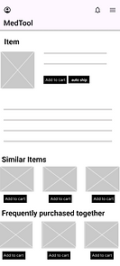


Iterations
After creating the low-fidelity prototype, I performed a usability test to determine the flow, what worked, and any issues to address and solve during the next set of design iterations.
Good flow.
It was easy to navigate through the pages.
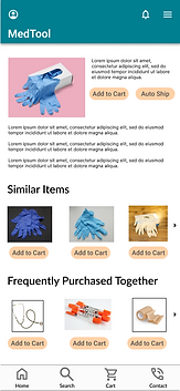
Auto ship.
Adding an auto ship feature would be helpful to schedule deliveries in advance.
Collaboration.
It would be great to have the ability to collaborate with other staff members at the organization, with a shared cart.
Addressing Challenges
Cohesive interface
While this app is intended for medical professionals, it must be easy to navigate for anyone. Whoever opens this app will be able to navigate the pages easily, with recognizable iconography, intuitive gestures, and a linear purchase process.
Accessibility
One of the main pain points for professionals is that they need to order from multiple sites to get all their needed supplies. By pulling everything into one location, the way we've seen in other apps like Amazon, Etsy, and even specific retailers such as Walmart that offer products from sources outside of their own company, we can provide a one-stop-shop for all users!
Linear purchasing
Getting from A to B is easy with MedTool, there will be no confusion for users to get from finding the exact product they need, adding it to their cart, and checking out.
Style Guide


Takeaways
MedTool is exciting for me for several reasons. First and foremost, this is my first UX/UI design project. I was learning to use the software, and putting all of the design skills I have learned throughout several careers to practice, while organizing the knowledge into a UX/UI frame set. I also got to put into practice new skills learned while completing my Google UX/UI Design Certificate.
This sort of tool can be used in many ways, and for many health-related programs. It could be used to order supplied for global public health projects abroad, or laboratories across the country and around the world. Likening it to Amazon, I believe a tool like this could become a great asset in the professional health world.